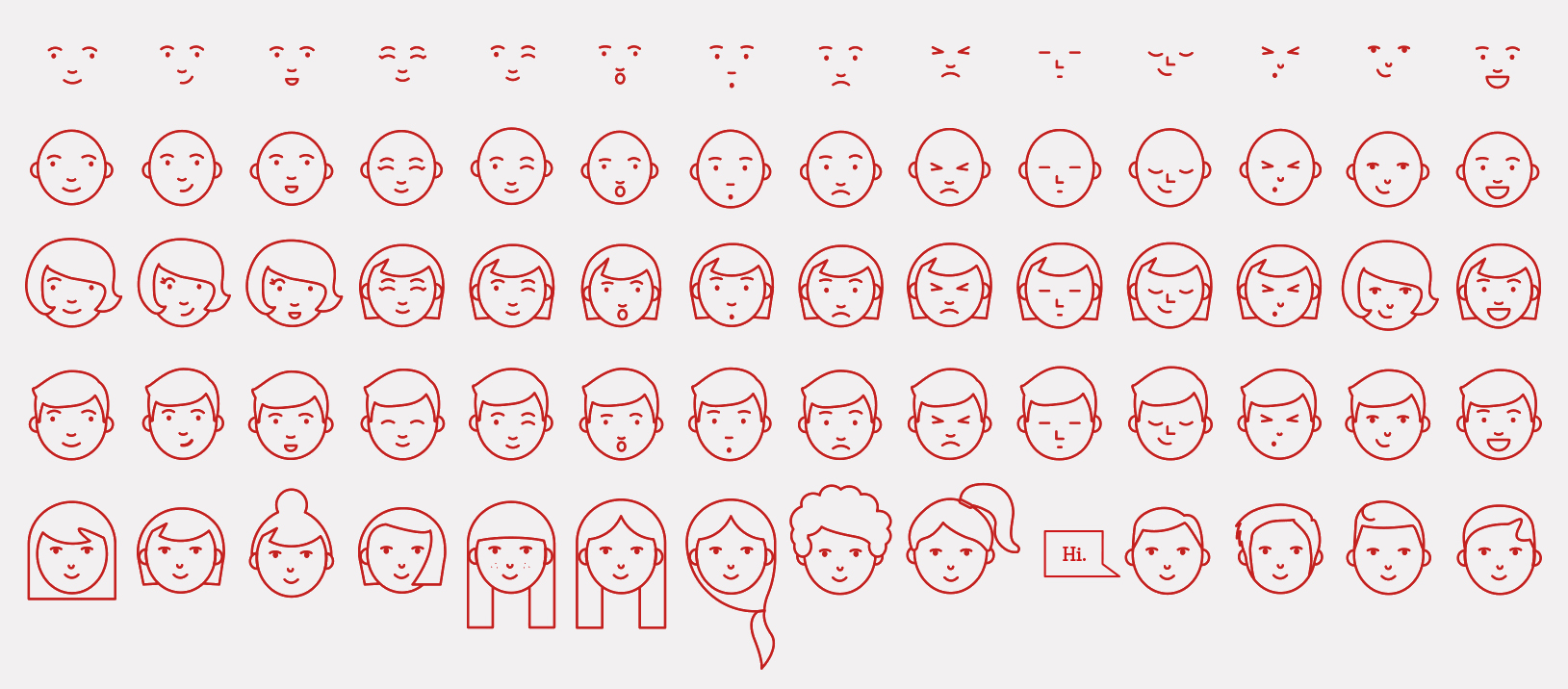
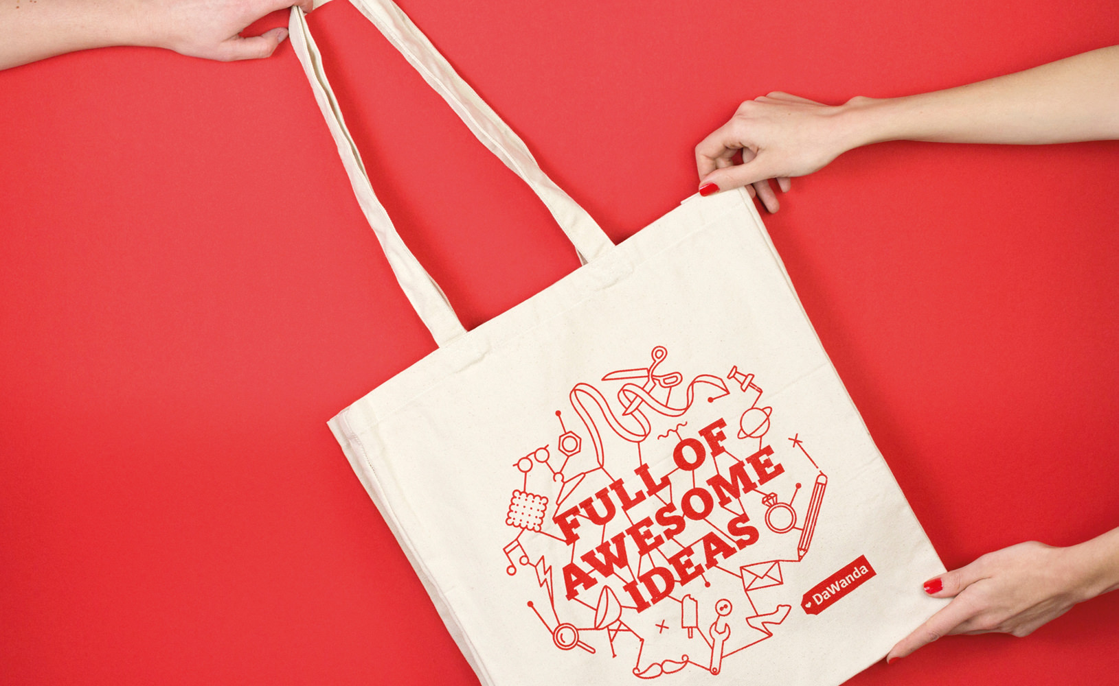
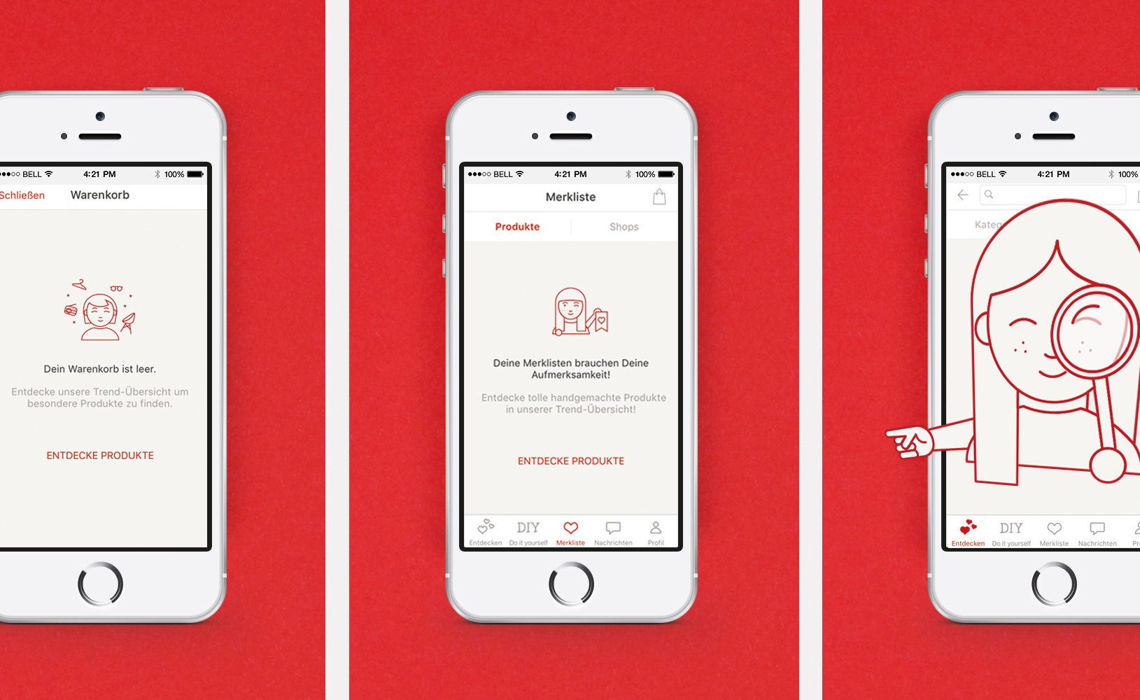
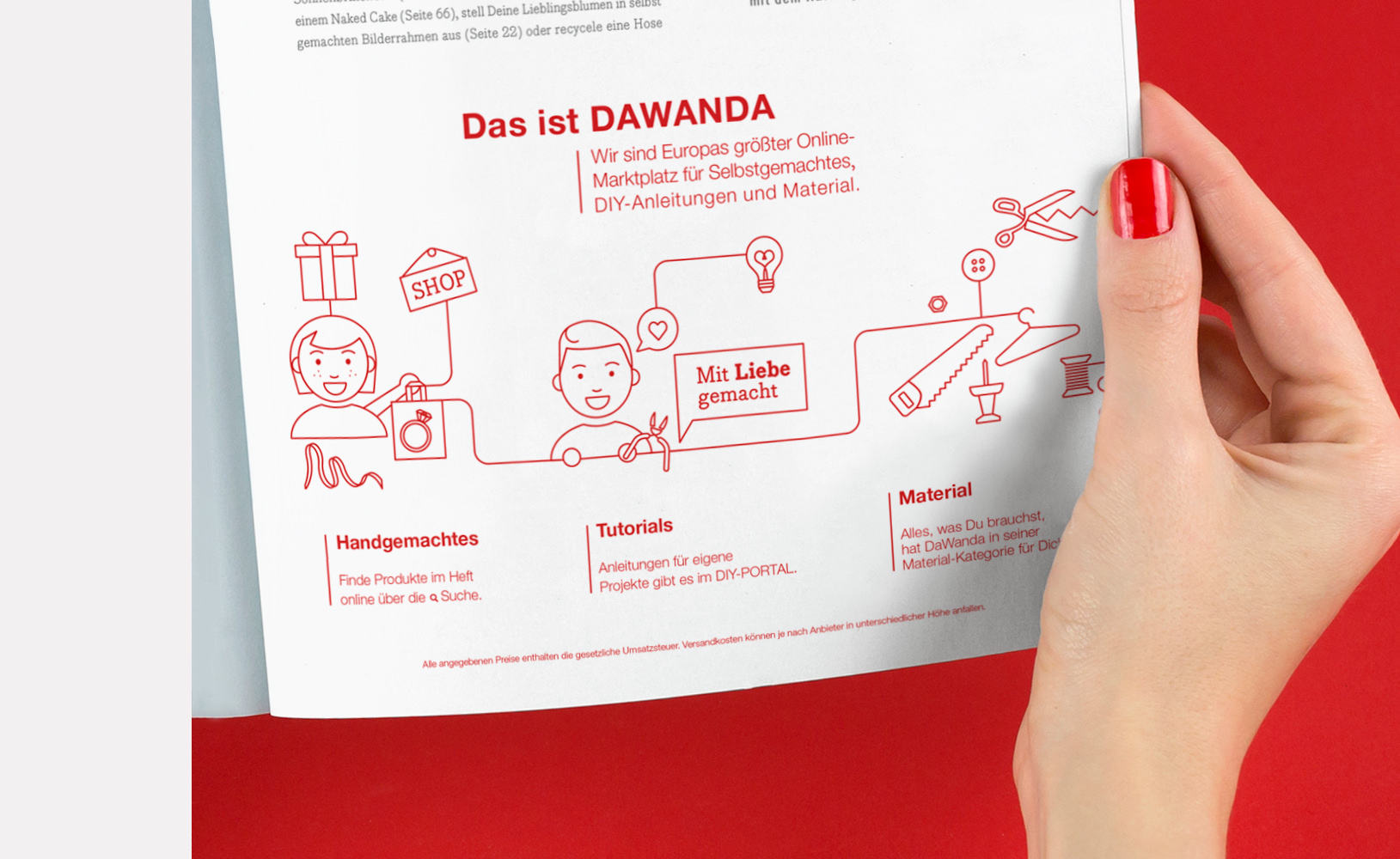
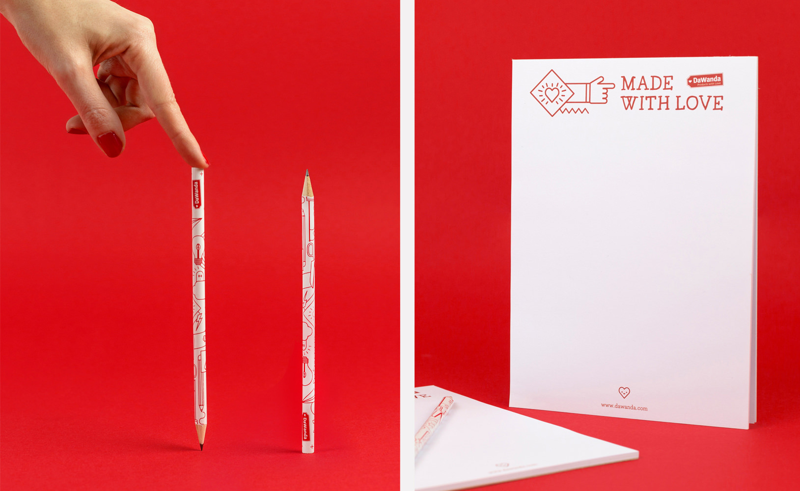
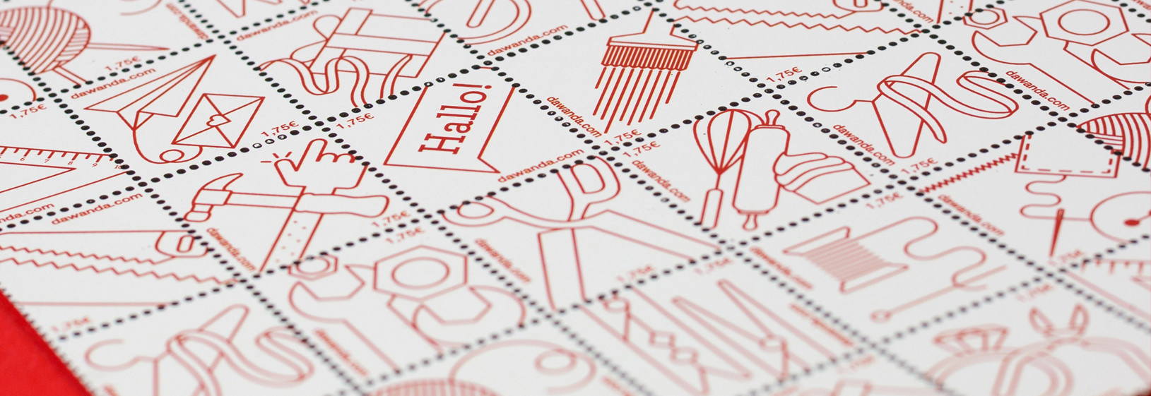
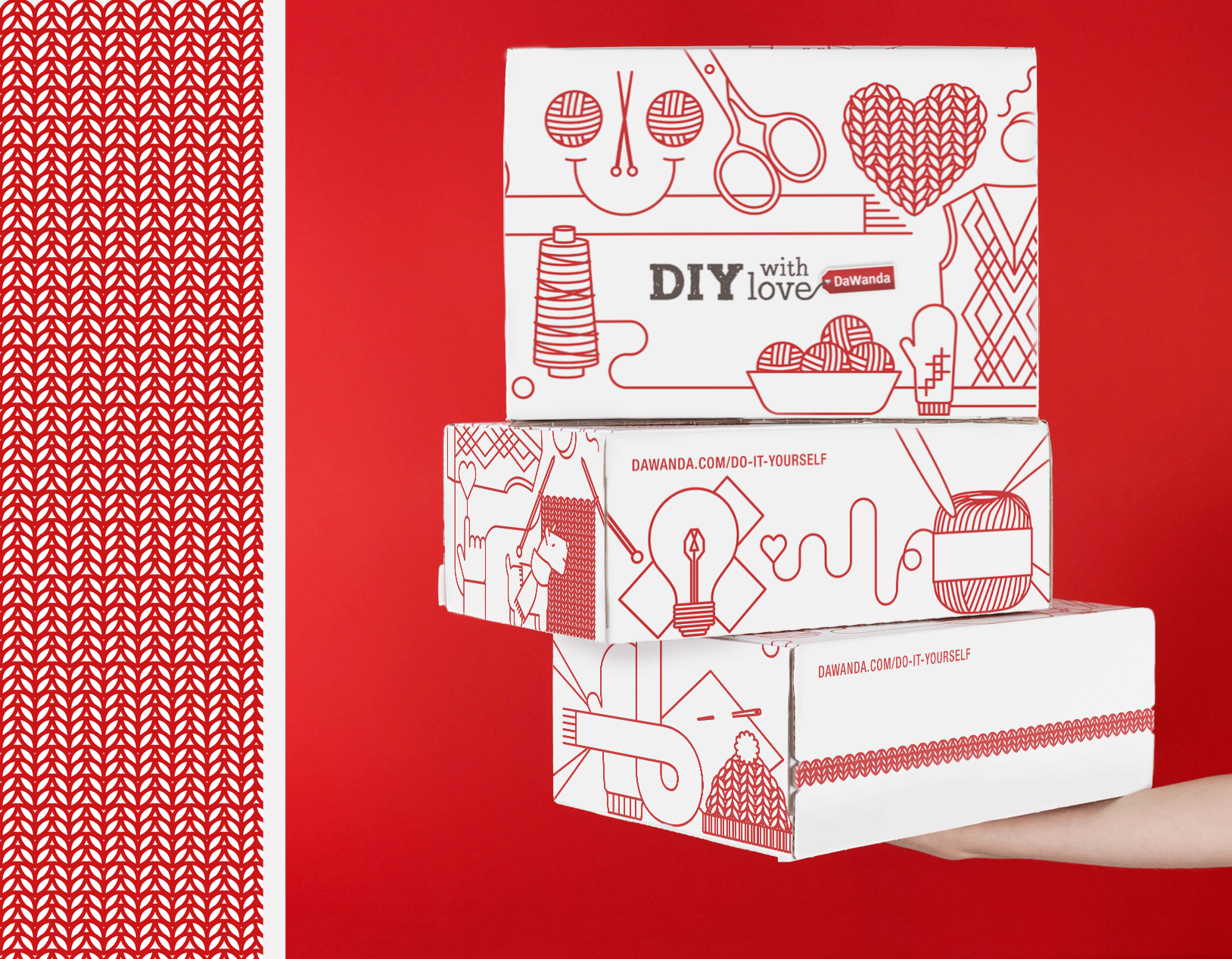
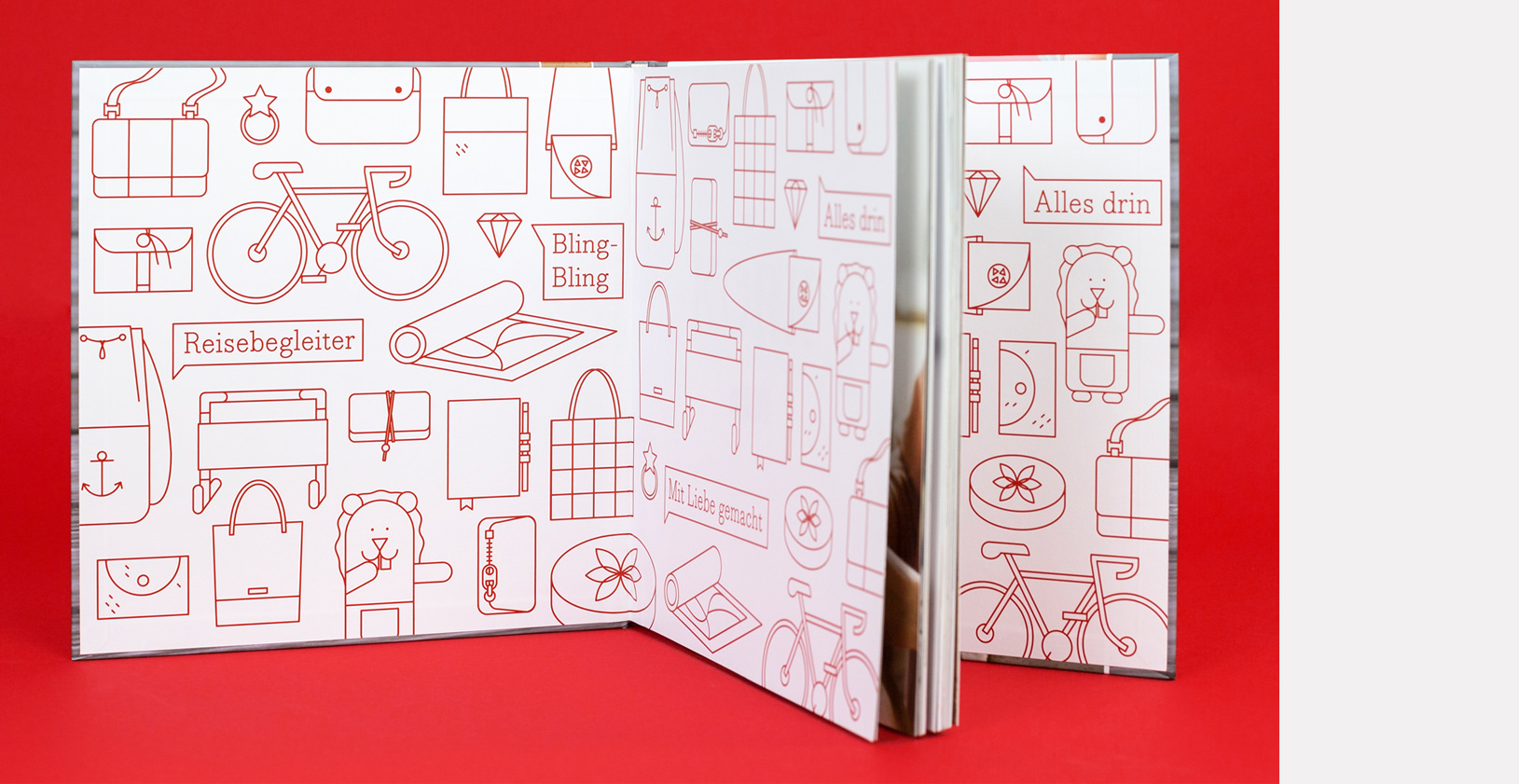
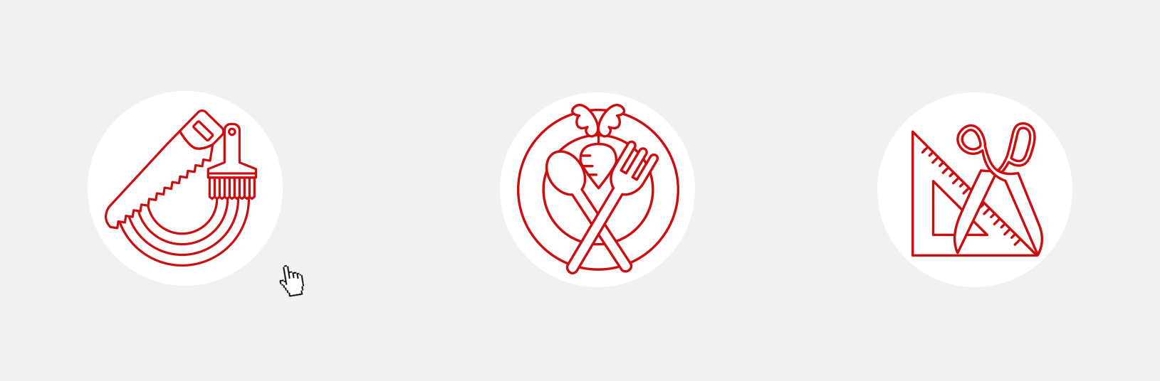
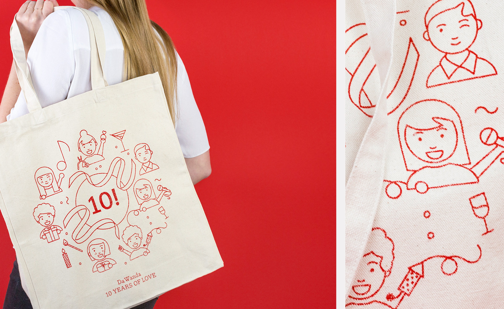
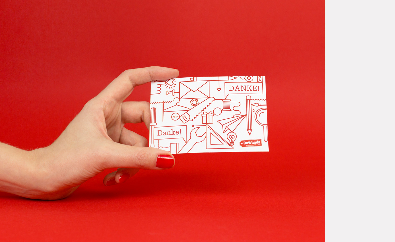
DaWanda has always been a very passionate and playful marketplace. It became clear that the redesign of the illustration style needed to be much more than a single logo, much more than a single icon. It needed complexity, life, personality. The icons could also be more illustrative, telling stories, showing the landscape, translating the passions of sellers, buyers and the brand itself. The decision was quite simple to use a red twine to create a joyful surrounding throughout all media, starting from a simple faces kit to an extensive library of products, tools, things – adding even a bit christmas feeling to it when required.